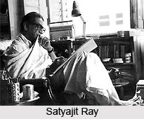
 Satyajit Ray as an artist has created some of the best works that the world has ever seen. He was a multi dimensional personality who has revolutionized the Indian art from. During his art education in Viswa Bharati University founded by Rabindranath Tagore he was highly inspired by his masters Nandalal Bose and Benod Behari Mukherjee. These two stalwarts of Bengali art actually had a profound impact on young Ray. Later, during his initial career as a junior graphic designer, he would first envisage a thought and a picture, then go on to explore its deep meaning, and then give it a meaningful form and shape, finally corroborating it with the original image he had in mind, be it for a cover of a book or an illustration for a story or a poster of a film.
It is actually Satyajit Ray who was a pioneering force behind the new wave in Indian commercial art form. He added aesthetic touch and innovative thoughts to it. He revolutionized the art of typography and book jacket designs. His work experience as a graphic designer left him a more creative person.
Typography by Satyajit Ray
Interest for typography within Ray did not actually initiate with metallic letters used for printing but with calligraphy done with thick brush. The lavishness of Ray`s calligraphic typography attracted the attention of lot of people in 1943. That very year he started to work as a cover designer for books published by Signet Press. He designed advertisement logo for new publications and modern Bengali poems.
He also designed advertisements for new publications to fill the very small spaces he got in the yellowish pages of the well-liked periodicals printed in newsprint. No metallic types satisfied him, so he used his own skills and creativity to draw the cover to go with the mood of the poem. For the covers he found no metallic type suitable enough to go with the moods of the poems. Satyajit Ray created numerous new Bengali typefaces which have refreshingly original yet perfectly legible form.
The typefaces designed by Ray may be classified into two different streams: architectural (replicable) and calligraphic (non-replicable).
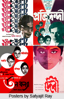 Satyajit Ray designed and created architectural typefaces for the logos and titles that would be repeated for a given period in all the issues of periodicals, including Sandesh, the children`s magazine that he edited. On the other hand, he very often designed calligraphic letterings for the frontispieces that would be printed only once.
Ray created only four Roman fonts (Ray Bizarre, Ray Roman, Daphnis and Holiday Script), while he created many new fonts in Bengali.
Daphnis is actually partly architectural. The upper parts of the letters are architectural, while the lower parts are not. Ray Bizarre too is partly architectural for the same reason. Holiday Script looks like an accidental creation in a game played among friends during a picnic.
Ray is the first and possibly the only designer artist of typefaces in Bengal who inspired an entire community to love and appreciate the beauty of the letters and alphabets of their mother tongue. One of the reasons for the Bengali`s love of reading is their ability to appreciate the beauty the Ray typography
Illustrations by Satyajit Ray
Satyajit Ray worked as an illustrator and had his own style of designs which we have come to love and appreciate. He studied art for two years and five months at Viswa Bharati University in Shantiniketan. There he mastered the art of handling the painting brush with extreme dexterity. He learned the detailed use of a brush and also how to use brush strokes in varied thickness for one particular composition. There were times when his brushing became harsh and coarse, full of fidgety energetic straight lines, and sometimes the lines had a lyrical flow.
He illustrated his book covers, film posters, children`s books, billboards, publicity material and even the title cards
Book Jackets by Satyajit Ray
 Satyajit Ray, abandoned the clean formal designing style, and transformed the idea of book cover designing in India. He was one of the first artists from India to experiment with the design and style of brushing that was purely Indian. His easy painting strokes, broad and pointed were the hallmark of his designs of book jackets during the early phase of his career. But his education in Shantiniketan and the inspiration he drew from Benode Behari Mukherjee and Nandalal Bose, his teachers, initiated him in a journey that found expression in numerous designs and styles. At every given stage he re-invented himself as an artist and designer and broke various boundaries and became a legend.
His typical style made it possible for him to create masterpiece for Signet Press (a publishing house that Ray designed the cover of the abridged Bibhuti Bhushan Bandopadhyay novel Pather Panchali, that went on to become the inspiration for his magnum opus).
Advertisements by Satyajit Ray
After finishing his art education in Shantiniketan for over two years he returned to Kolkata and joined an ad company named D.J. Keymer where he worked as a junior graphic designer. He worked there for 13 years before plunging into filmmaking.
Costumes by Satyajit Ray
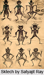
Satyajit Ray always maintained a red cloth bound copy (Kheror Khata), where he sketched his editing, cinematography, art direction and designs. He designed posters, slides, titles, booklets, publicity materials and everything that post production required. His talent and ingenuity found expression in meticulously designed dresses and costumes for his characters. One of the most important costumes that he designed was for his film named Goopi Gyne Bagha Byne (The Adventures of Goopi and Bagha) and Hirak Rajar Deshe (The Kingdom of Diamonds).
In his Goopi Bagha series he designed the costumes in great details for the character of Goopiy, Bagha, King of Shundi, and the ministers of King of Diamonds, the Chief Minister, the magician, the guards and the sycophant. He also designed the magical slippers that Goopi and Bagha used in the film.
